RA 2

RA 2
Signed Print
Bridget Riley
£30,000-£50,000
$60,000-$100,000 Value Indicator
$60,000-$90,000 Value Indicator
¥280,000-¥470,000 Value Indicator
€35,000-€60,000 Value Indicator
$310,000-$520,000 Value Indicator
¥6,230,000-¥10,380,000 Value Indicator
$40,000-$70,000 Value Indicator
There aren't enough data points on this work for a comprehensive result. Please speak to a specialist by making an enquiry.
87 x 76cm, Edition of 75, Screenprint
Auction Results

Track auction value trend
Meaning & Analysis
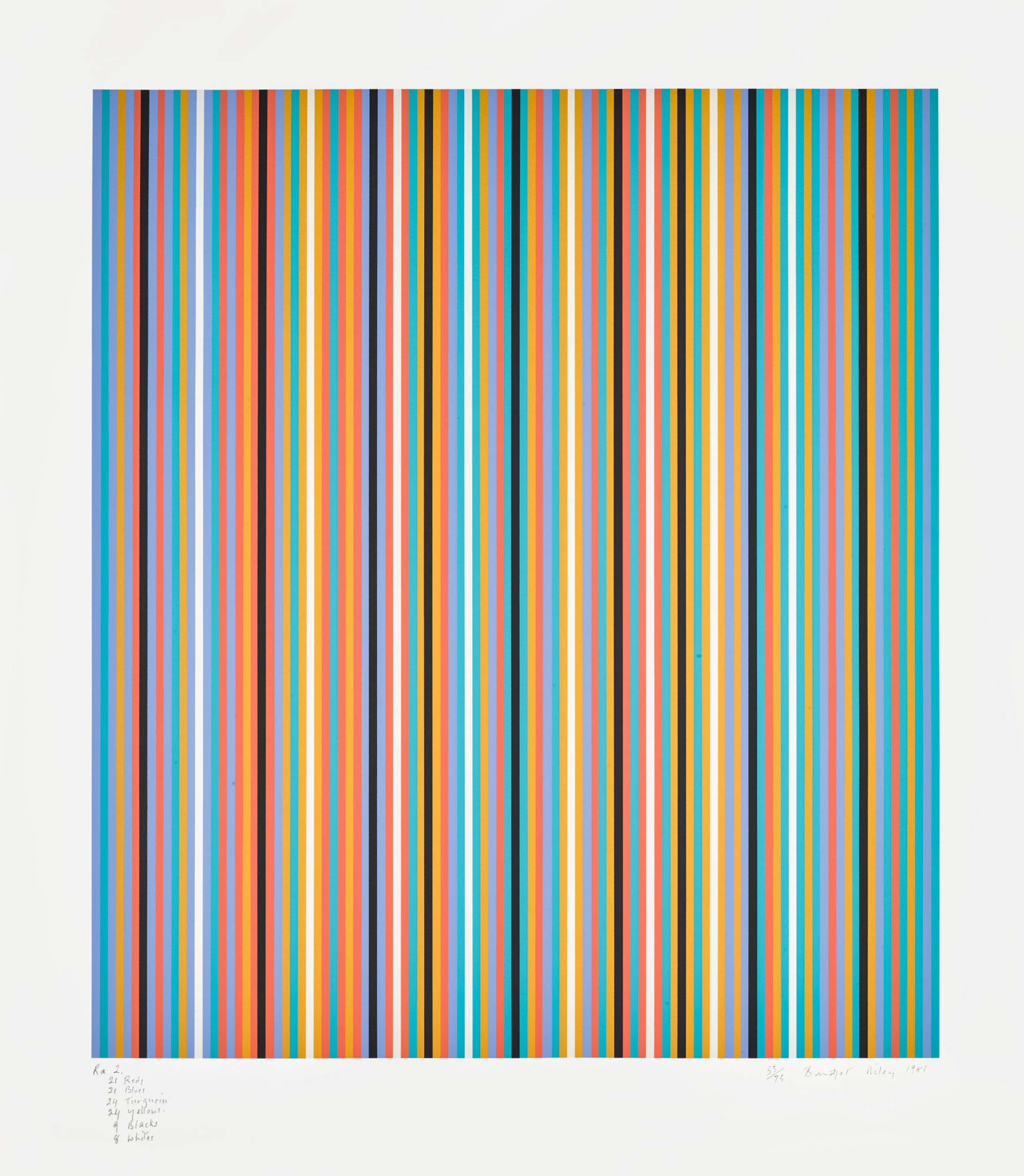
RA 2 is a signed screen print, produced by Op artist Bridget Riley in 1981. The print depicts a composition of successive vertical stripes rendered in bright colours. Blue, orange, green and red dominate the composition and the variation of colour and thickness amongst the lines makes this print very optically stimulating. The use of colour in this print captures Riley’s interest in colour and her fascination with the way in which it can elicit an emotional response in the viewer.
The print belongs to Riley’s Stripes collection which the artist started in 1971. The collection is composed of a series of prints, all of which depict formulaic patterns of successive lines, either horizontal, vertical or diagonal. While Riley rose to fame with her notable black and white paintings, the artist decided to explore the use of colour in the mid-1960s and cites artists such as Henri Matisse and Georges Saurat as important influences on the development of her artistic style.
Discussing the Stripes collection and why she chose such simple line patterns, Riley explains, “If I want to make colour a central issue, I had to give up the complexities of form with which I had been working. In the straight line I had one of the most fundamental forms”.