Art Album Covers: Creative Collaborations Between Artists and Musicians

 Lonesome Echo © Jackie Gleason 1955
Live TradingFloor
Art and music have long been intertwined, elevating one other in the myriad ways. Album covers in particular have offered a vibrant canvas for these two creative disciplines to meld, resulting in pieces that transcend sound and sight to create something entirely unique. Artistic collaborations between musicians and visual artists have produced some of the most iconic and memorable album covers in history, with the works often becoming symbols of the counterculture movements they represent.
This article will explore some of the most famous collaborations between artists and musicians in album cover art, exploring the dynamic partnerships that have embraced the very essence of creative expression and celebrating the confluence of these two mediums.
 Lonesome Echo © Salvador Dalí and Jackie Gleason 1955
Salvador Dalí & Jackie Gleason’s Lonesome Echo (1955)
Lonesome Echo is an album by Jackie Gleason, who was widely known as an actor and comedian but also ventured into the world of music, where he made a name for himself as an orchestra leader and composer. His music primarily focused on easy listening, using mood music and lush orchestral arrangements. This is one such example of Gleason's atmospheric and evocative musical style, featuring a collection of instrumental tracks designed to create a soothing and romantic ambiance.
The album is notable not only for its music but also for its iconic cover art, a collaboration between Gleason and the famed Surrealist artist Salvador Dalí. It is a visually striking and expectedly surreal piece of art, featuring a desolate desert with several figures including a woman, a snail, a stringed instrument and a large butterfly on a stick. It was created in 1955, and is even signed by Dalí – a clear sign that the collaboration sits front and centre in this album.
The collaboration between Gleason and Dalí demonstrates the deep connection between music and visual art, as the surreal nature of the artwork complements the dreamy, otherworldly quality of the music contained in the album.
 The Velvet Underground, Nico and Andy Warhol © Steve Shapiro 1965
Andy Warhol & The Velvet Underground and Nico (1967)
One of the most memorable collaborations between a visual artist and musician was that of Andy Warhol, the band The Velvet Underground and singer Nico. Together, they created one of the most impactful album covers of all time: that of The Velvet Underground & Nico.
‘The Velvet Underground & Nico’ is the debut album by the rock band The Velvet Underground, and was released in March 1967. Featuring German singer Nico as a guest vocalist, the album is renowned for its experimental and avant-garde approach to rock music. The band was led by Lou Reed and John Cale, and was closely associated with the Pop Art legend Andy Warhol, who played a pivotal role in their early success. He produced the album and created its highly recognisable cover art, which features a simple yet striking image of a yellow banana on a plain white background, with the artist’s name underneath The original album cover was interactive, as the banana peel was a sticker that could be peeled back to reveal a pink coloured banana underneath.
 The Velvet Underground & Nico © The Velvet Underground, Nico and Andy Warhol 1967
The collaboration between The Velvet Underground, Nico, and Warhol is an excellent example of the creative synergy that can arise when musicians and visual artists work together. This partnership resulted in an album that remains a touchstone in rock history, with the cover art standing as a symbol of the countercultural movement of the 1960s and the daring, innovative spirit that defined The Velvet Underground's music.
 Image © London Features International / The Beatles and Peter Blake 1967
Peter Blake & The Beatles’ Sgt. Pepper’s Lonely Hearts Club Band (1967)
The iconic quarter entrusted Pop artists Peter Blake and his then-wife Jann Haworth to design the album cover for their eighth album, Sgt. Pepper’s Lonely Hearts Club Band. The groundbreaking concept album is widely regarded as one of the most influential and important albums in the history of music, and is known for its experimental sound, innovative recording techniques, and diverse range of musical styles. It marked a significant departure from the band’s previous work, embracing a more complex approach to songwriting and overall production.
 Sgt Pepper’s Lonely Hearts Club Band © The Beatles, Peter Blake and Jann Haworth 1967
The cover art is a visually striking collage that has become synonymous with the spirit of the 1960s. It features the band members dressed as the fictional Sgt. Pepper’s band, surrounded by life-sized cardboard cutouts of famous figures including writers, actors, musicians, and other notable personalities. This eclectic mix of characters represents a wide range of cultural and artistic influences, reflecting the album’s diverse sounds and themes. The making of the cover art was a collaborative effort between The Beatles, Blake and Haworth, with the band members providing input on the figures they wanted to include in the collage. In total, there are around 70 individuals featured on the cover, including Bob Dylan, Edgar Allan Poe, Karl Marx, Marilyn Monroe, amongst others.
The elaborate cover design was a significant departure from the typical album artwork of the time, setting a new standard for creative collaborations between musicians and visual artists. Sgt. Pepper's Lonely Hearts Club Band is not only musically influential but also culturally and artistically significant. The album and its art left an indelible mark on the history of popular music and continue to inspire musicians and artists alike, more than five decades after its release.
 Image © Rolling Stone / Mick Jagger and Andy Warhol 1977
Andy Warhol & The Rolling Stones’ Sticky Fingers (1971)
After his successful venture into album cover designing with The Velvet Underground, Andy Warhol also collaborated with The Rolling Stones for their 1971 album Sticky Fingers.
This album is notable for being the band's first release on their own record label, and features a diverse range of musical styles including rock, blues, country and even some gospel. It includes some of the band’s most enduring songs, such as Brown Sugar, Wild Horses, and Can't You Hear Me Knocking.
 Sticky Fingers © The Rolling Stones and Andy Warhol 1971
The album cover for Sticky Fingers is as famous as the music it contains, thanks to its unique design and Warhol’s involvement. It is a black and white photograph showing a close-up of a jeans-clad male crotch with the visible outline of a penis. The cover of the original vinyl LP featured a working zipper and perforations around the belt buckle that opened to reveal a sub-cover image of white briefs. The vinyl release displayed the band’s name and album title along the belt, and behind the zipper the underpants were seemingly rubber stamped in gold with Warhol’s stylised name.The concept for the cover art was conceived by Warhol, while the actual photography was executed by Billy Name and graphic design by Craig Braun. The provocative and interactive nature of the cover art generated significant controversy upon the album’s release, which has since become a memorable and iconic representation of the band's edgy and rebellious image.
The collaboration between The Rolling Stones and Andy Warhol highlights the powerful synergy that can be achieved when musicians and visual artists come together to create something groundbreaking. They went on to collaborate again for their 1977 album Love You Live.
![An image of the album cover for The Faust Tapes, designed by artist Bridget Riley. It is a black and white optical illusion, creating a disorienting sense of waves on a flat canvas.]](https://cdn.sanity.io/images/dqllnil6/production/e3913e2d0bc9c2fa34c2dfe180a5533e60169b9c-500x500.jpg?w=3840&q=60&auto=format) The Faust Tapes © Bridget Riley and Faust 1973
The Faust Tapes © Bridget Riley and Faust 1973Bridget Riley & Faust’s The Faust Tapes (1973)
Artist Bridget Riley is notorious for her ability to create a sense of disorientation in the viewer, experimenting with new sensations. So it is no wonder that the German rock band Faust chose her artwork for the cover of their album The Faust Tapes, released in 1973. The album is an avant-garde collection of tracks that showcase the band’s experimental approach to music and their unconventional techniques, including the use of non-traditional instruments, tape manipulations, and the blending of various genres, such as psychedelic rock, electronica, and noise.
The cover features a striking black and white geometric pattern that creates an optical illusion, giving the appearance of movement and depth. The mesmerising visual effect of the artwork complements the experimental nature of the music on the album, demonstrating how the combination of groundbreaking music and visually stimulating art can create a unique and memorable artistic experience.
 Quan L’aigua Es Queixa © Joan Miró and Raimon 1979
Joan Miró & Raimon’s Quan L’aigua Es Queixa (1979)
Raimon is a Spanish singer-songwriter who is known for his contributions to the Nova Cançó movement, which sought to promote Catalan culture, language and music during the period of Francisco Franco's dictatorship in Spain. He also was a close friend of Joan Miró, famous for his unique combination of geometric abstraction, surreal fantasy and Catalan folk motifs. They collaborated twice throughout the years, the first time also being the album cover for the 1965 album Cançons De La Roda Del Temps.
The second collaboration was for the album Quan L’Aigua Es Queixa, which was assembled from six concerts hosted at the Palau de la Música Catalana. It features one of Miró distinct abstract motifs, depicted in primary colours, alongside a stylised version of the musician’s name. Eventually, Raimon composed a song named A Joan Miró, paying homage to his close friend and collaborator.
 I Cry For You © Roy Lichtenstein and Bobby “O” 1983
Roy Lichtenstein & Bobby “O”’s I Cry For You (1983)
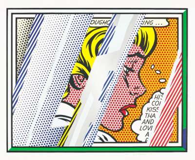
Bobby "O" (or Bobby Orlando) is an American music producer, songwriter, and musician known for his significant contributions to the dance music and Hi-NRG genres in the 1980s. He is often credited as one of the founding figures of the sound and has worked with several notable artists, including the Pet Shop Boys. In 1983 he released his single I Cry For You, a dance track that showcases his signature style, blending catchy melodies with an infectious beat and synthesiser-driven instrumentation. For this single cover he commissioned a work from Pop Art great Roy Lichtenstein, who delivered the illustration of a crying woman in his signature style, depicted monochrome against a bright yellow background.
 Image © Stephen Torton / Rammellzee and Jean-Michel Basquiat 1982
Jean-Michel Basquiat & Rammellzee and K-Rob’s Beat Bop (1983)
Jean-Michel Basquiat was no stranger to the world of music, and he was more involved in the making of Beat Bop than previous artists on this list have been. In fact, he did more than just design the cover art – he also personally produced and arranged the song, fostering the collaboration between Rammellzee and K-Rob. Officially released in 1983 as a 12-inch single, it is now considered a classic hip-hop track due to its experimental sound and distinctive 10-minute runtime.
The cover art is in Basquiat’s characteristic neo-expressionist style, combining elements from graffiti, text and abstract imagery. Unlike most of his works, however, it is black and white. The front cover includes his crown motif, rough sketches of bones, an explosion with the word "bang!", lightning bolts and Roman numerals. The artwork reflects the energy and innovation of the music, highlighting the connection between the burgeoning hip-hop scene and the contemporary art world.
This organic collaboration between Rammellzee, K-Rob and Jean-Michel Basquiat has since become a prime example of the creative intersections between music and visual art in the early days of hip-hop.
 Duck Rock © Keith Haring and Malcolm McLaren 1983
Keith Haring and Dondi & Malcolm McLaren’s Duck Rock (1983)
Duck Rock is a groundbreaking album by British music producer and impresario Malcolm McLaren, released in 1983. McLaren, best known as the manager of the Sex Pistols and the New York Dolls, ventured into his own musical career with this album, a unique fusion of various musical styles, including hip-hop, world music, and electronic dance music. The album is notable for its innovative approach to incorporating different global music influences, such as African, Caribbean, and South American sounds.
The cover art for Duck Rock contains as the background an illustration by the famous artist Keith Haring, who was an especially prominent figure in the New York art scene during the 1980s. Haring’s artwork is characterised by its bold lines, vibrant colours, and dynamic figures, often inspired by graffiti and street art. The cover art background features several of Haring's iconic characters, including dancing figures and snakes, rendered in vivid colours. Meanwhile, the graffiti artist Dondi was tasked with providing the lettering, which is chaotic and colourful.
The inclusion of Haring’s and Dondi’s art in this innovative and genre-defying nature illustrates the fame achieved by these artists during their lifetime, having already crossed into pop culture. It also shows how creatives from all mediums get together to collaborate on how to best express a certain feeling or emotion.
 Someone Like You © Keith Haring and Sylvester 1986
Keith Haring & Sylvester’s Someone Like You (1986)
Keith Haring was evidently pleased with his previous collaboration, since he decided to try it again – this time with singer Sylvester. For the musician’s song Someone Like You, Haring leaned hard into his distinct style, and chose to feature a vibrantly colourful group of dancing figures that fit perfectly into the song’s disco style. The single came out in 1986 and became a hit, reaching No. 1 on the Billboard Dance Club Songs chart.
As a collaboration, both the cover and the song illustrate the joy and energy of the New York club scene in the 1970s and 1980s, one that was sadly being impacted by the AIDS epidemic that would eventually take both of the artists’ lives. Before his premature death, Haring collaborated with many other artists for their album covers, including David Bowie.
 Blur: The Best Of © Blur and Julian Opie 2000
Julian Opie & Blur’s The Best Of (2000)
Rock band Blur enlisted the help of contemporary artist Julian Opie to create the album cover for their compilation album released in 2000. The album features a selection of the band's most popular songs from their first five studio albums, serving as a celebration of Blur's success and showcasing their versatility and impact on the music scene throughout the 1990s.
The album cover for Blur: The Best Of features four portraits of the band’s members, done by Julian Opie in his signature minimalist and caricatured style. Each figure sits against a distinct solid colour background, and the design reflects the eclectic and playful nature of Blur's music, making the compilation album visually appealing and instantly recognisable.
 I’ll Take The Rain © R.E.M. and Yoshimoto Nara 2001
Yoshitomo Nara & R.E.M.’s I’ll Take The Rain (2001)
Yoshitomo Nara was chosen by band R.E.M. to illustrate the cover for their single I’ll Take The Rain in 2001, issuing a limited edition 7” version. Nara’s original artwork for the single features one of his signature characters in a seemingly contemplative pose. The dog’s body language and the artwork's overall atmosphere align with the introspective and melancholic mood of the song. The character was then used to create the song’s entire music video, with the collaboration crossing into yet another medium. This marked the band’s first foray into animated music videos.
This collaboration between R.E.M. and Nara demonstrates how artists from different cultural backgrounds and disciplines can come together to create unique and memorable works of art.
 Think Tank © Banksy and Blur 2003
Banksy & Blur’s Think Tank (2003)
After their collaboration with Julian Opie, Blur decided to continue partnering with contemporary artists for their seventh album Think Tank. Released in 2003, the album’s cover art was designed by renowned British street artist Banksy, known for his thought-provoking and politically charged graffiti and stencil art. Banksy created an iconic and visually striking image for the album cover, featuring a black and white stencil of a couple embracing whilst wearing deep sea diving helmets. The artwork captures the album’s experimental nature and conveys a sense of isolation and disconnection, themes that resonate throughout the record.
They also utilised his work for the singles Good Song and Out Of Time, all of which also feature couples depicted in a monochromatic style. In Good Song, two children holding a heart shaped balloon atop a mountain of guns. In Out Of Time, on the other hand, a couple is on a date while wearing wind-up mechanisms. The woman appears unconscious on the table, having dropped her glass of wine, insinuating her mechanism has run out.
 Image © Kaikai Kiki / Takashi Murakami and Kanye West 2006
Takashi Murakami & Kanye West’s Graduation (2007)
Kanye West was about to reach his peak when he released his third studio album Graduation in 2007. The album marked a significant shift in West’s musical direction, embracing a more anthemic sound and drawing inspiration from various genres such as house, electro, and synth-pop.
 Graduation © Kanye West and Takashi Murakami 2007
The cover art for this genre-bending album was designed by Japanese contemporary artist Takashi Murakami, who is known for his vibrant anime-inspired aesthetic. Murakami created a colourful and visually striking image featuring West’s mascot Dropout Bear wearing sunglasses and university garb floating into outer space. The artwork captures the celebratory and futuristic atmosphere of the album and reflects West's penchant for combining music with innovative visual art. Murakami also directed the music video for Good Morning, one of the songs on the album.
Graduation was just the first of the collaborations between West and Murakami, which also included a cover design for Kanye West and Kid Cudi’s 2018 album Kids See Ghosts.
Murakami's work on West's Graduation redefined album art in the 2000s, and the artist has continued to leave his mark by designing covers for Juice WRLD’s posthumous album The Party Never Ends and NewJeans’ debut single Supernatural.
 Celebrate © Madonna and Mr. Brainwash 2009
Mr Brainwash & Madonna’s Celebration (2009)
In 2009, Madonna commissioned from Mr. Brainwash a work to be used for the cover of her album Celebrate. The final version takes clear inspiration from Andy Warhol’s Marilyns, replacing the subject with Madonna. In this way, the artist is continuously referencing one of the most iconic works in 20th century art history but modernising it by exchanging the visual reference for a more contemporary one and providing relevant comment on the nature of celebrity. Since then, Mr. Brainwash has done several iterations of this work both as paintings and prints, and some have even appeared as a form of graffiti in the background of his other works.
 See The Light © Damien Hirst and The Hours 2009
Damien Hirst & The Hours’ See The Light (2009)
The band The Hours, formed by Antony Genn and Martin Slattery, is known for their emotive and introspective sound. Their second album See The Light was released in 2009, and features cover art by notorious artist Damien Hirst. A leading figure in the Young British Artists movement and a friend of the band, Hirst is known for his provocative and often controversial works including sculptures, paintings and installations.
The artwork for See The Light illustrates Hirst’s fascination with death and features a human skull with an intricate design of colourful exploding lines, adding a striking visual dynamism to the album. About the collaboration, Damien stated: “Art and music have been fused since the 50s, and for me, in this day and age, anything done well is art.”
 My Beautiful Dark Twisted Fantasy © George Condo and Kanye West 2010
George Condo & Kanye West’s My Beautiful Dark Twisted Fantasy (2010)
Only a few years after his collaboration with Murakami, Kanye West decided to enlist contemporary artist George Condo to design the cover art for his fifth album My Beautiful Dark Twisted Fantasy, released in 2010. The album is widely considered one of West’s most critically acclaimed works, showcasing his versatility as a musician and incorporating various musical styles, such as hip-hop, progressive rock, and R&B.
West commissioned Condo to create several different artworks for the album, with the primary cover featuring a controversial and surreal image of West being straddled by a winged, armless, and nude female creature. The artwork aligns with the album’s themes of hedonism and the exploration of West’s dark inner psyche. The final cover had the artwork pixelated, implying West was still censoring himself.
Condo also did the cover for the single Power, which depicts a decapitated yet crowned version of Kanye’s head, impaled by a sword. It is a commentary on the dangers of excess and power.
 I’m With You © Damien Hirst and Red Hot Chilli Peppers 2011
Damien Hirst & The Red Hot Chili Peppers I’m With You (2011)
For their tenth album I'm With You, the Red Hot Chili Peppers asked artist Damien Hirst to create their album art. Released in 2011, the album marked a new era for the band, and the artwork features a simple yet striking image of a fly on a pill capsule. This was chosen because it symbolises themes of vulnerability, mortality and the fleeting nature of life. The minimalist approach of the artwork contrasts with the vibrant, dynamic sound of the album.
The artists continued their collaboration when Damien Hirst designed a limited-edition colourful bass to be auctioned off, the proceeds of which went to guitarist Flea’s charitable organisation.
 Lucky © Towa Tei and Yayoi Kusama 2013
Yayoi Kusama & Towa Tei’s Lucky (2013)
Towa Tei is a Japanese electronic musician who initially rose to prominence as a member of the influential music group Deee-Lite, best known for their 1990 hit Groove Is in the Heart. His fifth album Lucky was released 2013 and showcases Towa Tei's versatility as a producer, featuring collaborations with a diverse range of artists.
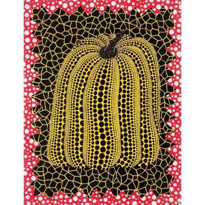
The album cover for Lucky was designed by Japanese contemporary artist Yayoi Kusama, known for her distinctive style, which often features vibrant colours and repetitive patterns such as polka dots. Kusama’s artwork is a reflection of her unique vision and has been exhibited in galleries and museums worldwide.The cover art for Lucky showcases Kusama's signature polka dot pattern and bold use of colours, creating a visually striking and memorable design that complements Towa Tei's eclectic and innovative musical style.
 Image © Page Six / Lady Gaga and Jeff Koons 2014
Jeff Koons & Lady Gaga’s Artpop (2013)
Another memorable example of a collaboration between visual arts and music was Lady Gaga’s 2013 album ARTPOP. In her third album, Gaga wanted to bring art and pop music together, showcasing her versatility as an artist and incorporating various musical styles, such as electronic dance music, synth-pop, and R&B.
 ARTPOP © Lady Gaga and Jeff Koons 2013
In line with her desire to place music within the visual arts, the cover art for ARTPOP was created by American artist Jeff Koons. The artwork features a collage-like composition, with a sculpture of Lady Gaga by Koons in the centre, surrounded by fragments of Botticelli's The Birth of Venus and other patterns. The design represents the album's themes of art, pop culture, and self-expression.
The album’s release was accompanied by an ambitious multimedia project called artRave, which included live performances, installations, and collaborations with various artists from the world of visual art, fashion, and technology, including Marina Abramović.


