Fertility
Suite
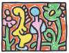
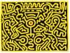
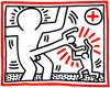
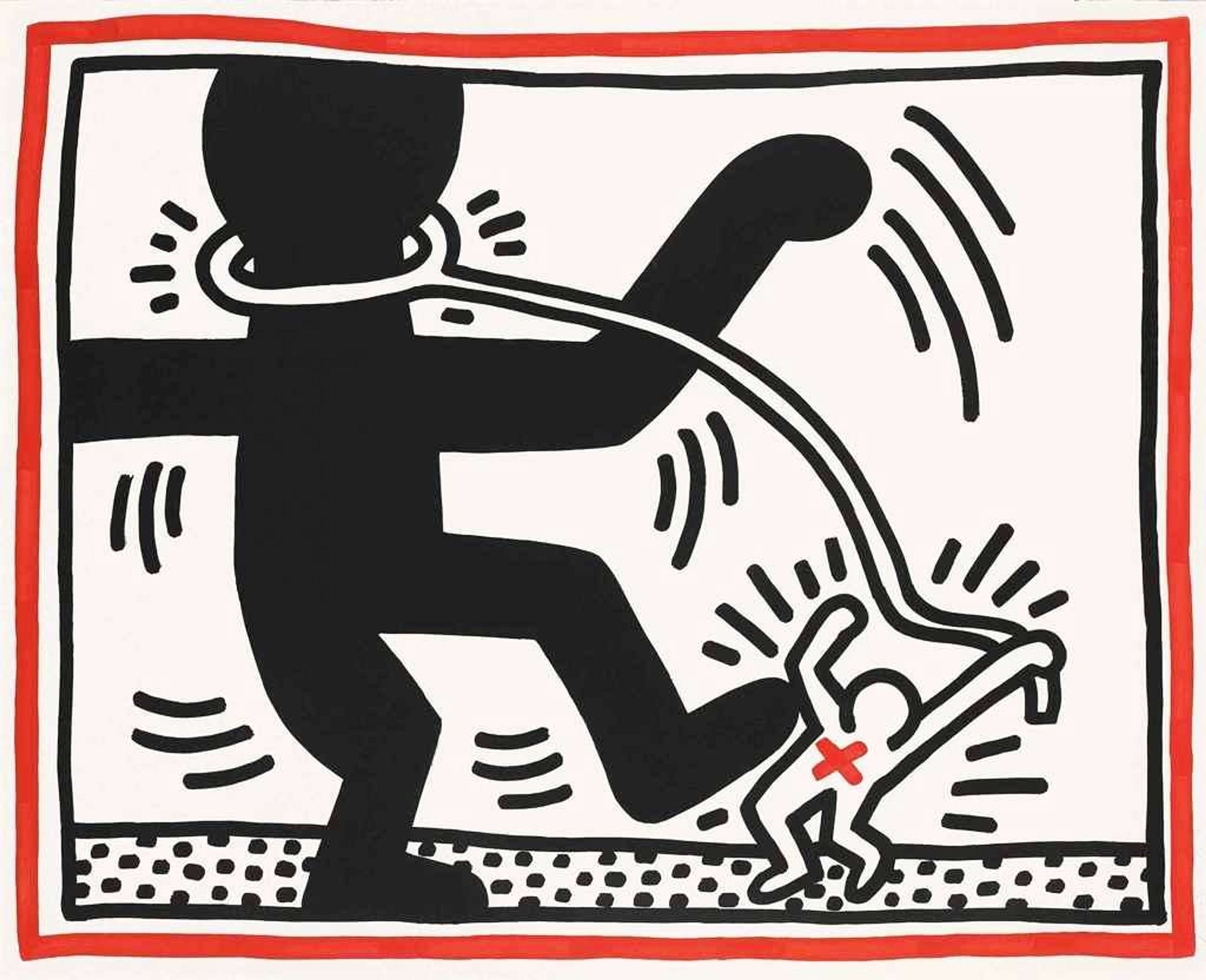
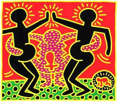
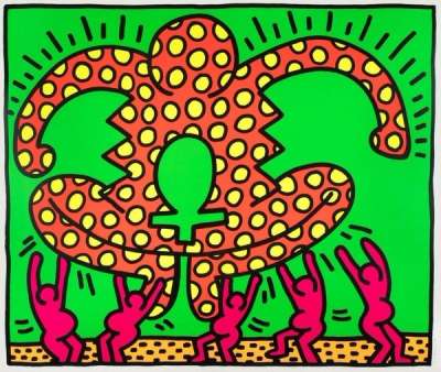
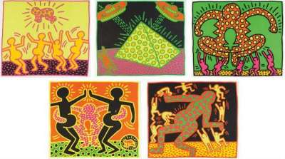
Keith Haring's 1983 Fertility Suite highlighted the prevalence of HIV infection among pregnant women in Sub-Saharan Africa, an issue that was largely suppressed due to the homophobia and racism shaping narratives. The series celebrates these mothers’ strength by including ankh crosses, glowing pregnant women, and dancing.
Keith Haring Fertility Suite for sale
Sell Your Art
with Us
with Us
Join Our Network of Collectors. Buy, Sell and Track Demand
Meaning & Analysis
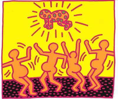
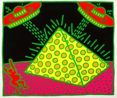
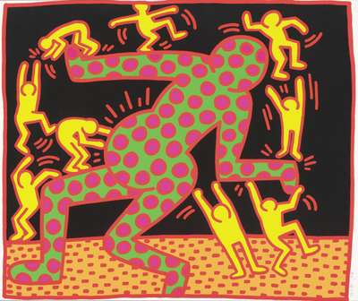
Not one to shy away from taboo topics, Haring’s Fertility celebrates life yet also the injustices of racism and the horrors of AIDS in pregnant women Rendered in the artist’s trademark visual language of bold colours, thick outlines and simplified form, this glowing and otherworldly series speaks out against the injustices of racism, homophobia, and the high prevalence of HIV infection among pregnant women in Sub-Saharan Africa in the 1980s, notably the transmission of the virus from mother to child.
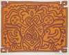
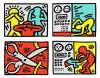
Across the five prints in Fertility Suite, Haring shows a set of recognisable, clear-cut motifs that translate into a complex narrative that celebrates fertility and life, whilst also highlighting the horrors faced by pregnant women living with HIV/AIDS. Haring uses the symbol of the pregnant figures dancing in energetic bodily motions as a recurring theme throughout Fertility, making the series one of Haring’s most powerful tributes to womanhood. Additionally, the prints include many other trademark symbols by Haring such as the Radiant Baby, the pyramid and UFOs, working to make this series an archetypal example of the artist’s style.
Formally the works are defined by their use of neon colours that are reminiscent of the New York club scene, initially perceived by the viewer as joyful images. Haring uses contrasting day-glow pigments such as yellow, pink, green, red and purple against sections of black, providing the series with an exceptionally bright visual language that appeals to adults and children alike.