Patrick Caulfield: The Master of Minimalism in British Art
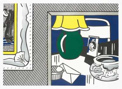
 Image © Sotheby's / Café Interior: Afternoon © Patrick Caulfield 1973
 Patrick Caulfield
42 works
Patrick Caulfield is celebrated for his paintings and prints, which made significant contributions to British Minimalism. Born in 1936, Caulfield’s artistic journey began at the Chelsea School of Art, leading him to be accepted into the esteemed Royal Academy of Art alongside notable contemporaries, including David Hockney. His practise continually evolved throughout the years earning him numerous awards and recognition.
One of the most remarkable aspects of Patrick Caulfield’s artistic style is its renowned blend of deceptively simple aesthetics and powerful compositions. Through an interpretive lens of his use of colour, line and form, Caulfield’s influence across various categories of contemporary art, ranging from abstraction, pop art and minimalism, becomes evident.
Patrick Caulfield's Styles and Techniques
Patrick Caulfield’s artistic approach is characterised by his use of strong colours, simplified forms and a sense of graphic clarity that is both innovative and captivating. His embodiment of a reductive visual language is heightened by emphasising essential elements to create impactful compositions. This artistic methodology positions him as a significant figure amongst British Minimalist artists.
Caulfield's work is often described as having a flat two-dimensional quality, as he intentionally simplifies subjects and architectural spaces to their most fundamental visual components. Through deliberate cropping and the absence of human presence, Caulfield achieves a unique, engaging, and thought-provoking aesthetic.
This innovative artistic exploration led Caulfield to experiment with stencils and screenprinting, a technique that became synonymous with his recognisable style of uniform and uninterrupted lines superimposed onto vibrant colour fields. Caulfield's artistic training reveals a meticulous approach where he would methodically apply acrylic paint onto the canvas using hand-painted stencils. This technique showcases his artistic precision and formal training while emanating a heartfelt and intimate quality, reflecting the artist's personal touch.
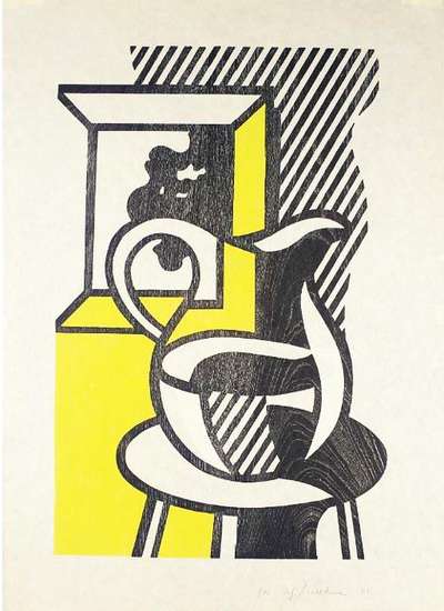
Caulfield's study of modern art and his interest in contemporary culture led to incorporating everyday objects and scenes into his work. These influences are evident in Pottery (1969) a still-life portrayal of ceramic objects. His trademark technique is evident through the deliberate application of black paint over vibrant colours, effectively capturing the essence of the objects and imparting a subtle sense of depth to the artwork. Likewise, Coloured Still Life (1967) showcases Caulfield's ability to elevate mundane objects by infusing the artwork with references to influential artistic movements, transcending the ordinary and inviting viewers to engage with the painting through the same formal elements utilised in its creation.
Another work, After Lunch (1975), also underscores Caulfield’s distinct style. This painting features a restaurant interior with a photorealistic view of the Château de Chillon, located off the shoreline in Lake Geneva, Switzerland. This image is superimposed onto one of the painted walls, creating the illusion of a window. The highly detailed photographic image juxtaposed with the flat, minimalist interior highlights Caulfield’s ability to play with perception and visual language.
Caulfield's pioneering exploration of colour and form, coupled with his refined technique, has left a lasting impact on succeeding cohorts of contemporary artists enriching the global conversation surrounding minimalism and abstraction.
Patrick Caulfield’s Influence on British Art
Patrick Caulfield’s distinct approach to minimalism and abstraction significantly influenced the trajectory of traditional British art, inspiring other artists within and beyond the 20th century through reductive techniques.
Among his contemporaries, Patrick Caulfield’s work influenced Irish-born Michael Craig-Martin, who used solid blocks of colour to depict everyday objects. English artist Gary Hume, who gained prominence in the 1990s as part of the Young British Artists (YBAs), also took note of Caulfield's techniques. Hume's work is characterised by vibrant colours and simplified forms, echoing Caulfield’s visual language yet maintaining his distinct minimalist approach.
Actively working contemporary artist Julian Opie's signature style is also heavily influenced by Caulfield. Known for his own reductive application, Opie’s artistic output draws clear parallels to Caulfield’s approach through colour, everyday scenes and his focus on the pure essence of his subjects.
Caulfield’s lasting impact on British art extends beyond individual artists and into the broader artistic landscape, as he played a crucial role in redefining the possibilities of abstraction and representation. His ongoing influence on subsequent generations of creatives has solidified his legacy as a central figure in art history whose work continues to captivate audiences and artists alike.
The Role of Humour in Patrick Caulfield’s Art
Caulfield’s art is further characterised by its incorporated use of humour and playful approach adding depth and complexity to his works. One example is I've Only the Friendship of Hotel Rooms (1993). This work presents a stark hotel room scene, evident from its title, which references a Jacques Prévert sonnet introducing a layer of irony by emphasising the loneliness and isolation often associated with transitory spaces. The narrative leaves the viewer contemplating the dissonance between the impersonal environment and the sentimental value the title implies.
Another artwork that employs this same irony is Candle-Lit Dinner (1981)—a collage-like painting featuring a table setting within an unoccupied restaurant interior. The work overlays chicken wings on a plate and flowers in a vase, creating a visually intriguing composition filled with melancholy and emptiness. In an ironic twist, the artwork sets expectations of a passionate ambience through the portrayal of a fine-dining, white tablecloth experience, yet infused with casual, non-gourmet food, for one. The incongruity between the title and the narrative creates an understated nuance that, again, prompts a deeper reflection on the themes presented in the artwork.
Loneliness emerges as a recurrent theme in Happy Hour (1996). Despite the suggestive title, which implies a lively gathering, the viewer is instead greeted by a single glass of red wine superimposed against a backdrop featuring a prominent ”EXIT’’ sign. This juxtaposition suggests the supposed ”happy hour’’ has ended.
A humorous take on thought-provoking concepts is integral to Caulfield’s distinctive approach. His ability to incorporate photorealism within abstract and minimalist compositions refers to his practice's hallmark style and conceptual complexity.
Patrick Caulfield’s Place in Art History
Patrick Caulfield occupies a unique and significant place in art history for his ability to bridge the gap between various artistic movements, genres and philosophies. His work is often seen as a distinctive fusion of elements from pop art, minimalism and abstract expressionism, reflecting the various categories of contemporary art during the mid-20th century.
Caulfield’s work is further interpreted as a response to the artistic innovations of the post-war period, which witnessed a rapid evolution of artistic styles and concepts. His ability to synthesise disparate artistic concepts and forge his own unique path reflects dynamism as he embraced and transcended traditional artistic boundaries. His versatile approach has solidified Caulfield’s position as a key figure in the development of modern and contemporary art.
 Image © Pixabay / Apple Trademark Silhouette © Image by Clicker-Free-Vector-Images
The Intersection of Minimalism and Pop Art in Patrick Caulfield’s Work
Patrick Caulfield’s work presents a unique intersection of minimalism and pop art, two artistic movements that dominated contemporary art in the 1960s and 1970s by fusing their distinctive elements to create his own compelling visual language.
Although he denied association with any particular movement, Caulfield's contribution to the British art scene is most evident through Pop Art influences. Stylistically, Caulfield’s work undoubtedly resonated with Pop Art and associated him as a prominent figure within, alongside other notable British artists, including David Hockney, Peter Blake and Richard Hamilton. Caulfield's work was also compared to American Pop artist Roy Lichtenstein's, a parallel that Caulfield resented. Caulfield thought his style to diverge from these artists by applying a minimalist approach to form and figuration with a heavy focus on abstraction. However, his chosen subject matter of everyday objects often situated him within the broader Pop Art milieu.
Arguably, his work also strongly connects to the Minimalist movement of the 1960s from a theoretical point of view. Minimalist artists, including Frank Stella and Donald Judd, sought to distil art to its most essential components, focusing on the purity of line, form and colour. Caulfield’s simplified compositions mirror these principles, albeit the subject matter remains rooted in the representational world.
Overall, Caulfield's artwork is a distinctive fusion of minimalism and pop Art. He skillfully bridges the gap between these seemingly opposing movements to create a visually striking and thought-provoking body of work.
Patrick Caulfield’s Legacy
Patrick Caulfield's imprint on the art world is through his pioneering work and innovative visual representation approach. His legacy is firmly rooted in his graphic style, characterised by flat, vibrant colours and black outlines to define forms. Caulfield's lasting impact on the art world can be seen in the myriad of contemporary artists who continue to draw inspiration from his approach.
Throughout his career, exhibitions have showcased Caulfield’s enduring significance. In 2013, Tate Britain held a survey exhibition of his work, much of which remains on display today. He has also been the subject of shows at the Yale Center for British Art, the Royal Academy, Hayward Gallery and Serpentine Galleries.
Patrick Caulfield’s Influence on Contemporary Design
Patrick Caulfield's unique fusion of Minimalism and Pop Art has profoundly impacted contemporary design. His innovative approach to visual representation has transcended the world of fine art, inspiring designers in various fields such as graphic design, advertising, and interior design. Caulfield’s stylistic approach lends itself incredibly well to modern graphic design, as it emphasises clarity, boldness and simplicity – making it ideal for conveying complex ideas or messages in a visually striking manner. Many designers have adopted this technique, applying it to various mediums such as posters, logos, and packaging. Notably, the literary world has also embraced Caulfield’s style: his works for Some Poems of Jules Laforgue have had a distinct impact on illustrations, and even the most recent iteration of Penguin Books’ logo has drawn clear inspiration from his bold style.
In advertising, Caulfield's style has inspired campaigns incorporating pop art and minimalist elements to create eye-catching and memorable visuals. As Caulfield demonstrated, vibrant colours and everyday objects evoke a sense of familiarity and accessibility while still capturing the viewer's attention. Some notable examples are the print adverts for Apple’s iPod – the flat colourful background, interrupted by distinct black silhouettes, which are overlaid with fine white lines to illustrate headphones and the iPod. This graphic contemporary advert references Caulfield's Girl on Terrace (1971).
Contemporary campaigns further demonstrate the widespread influence of Caulfild's artistic versatility and its impact on graphic design, advertising, product packaging and book covers. Overall, Caulfield's unique fusion of distinctive movements defined his signature style. His artistic genius lay in his ability to embrace and transcend fine art limitations, which impacted various creatives.
Caulfield remains a pivotal figure in British art and a key player in the broader art spectrum known for challenging conventions and inspiring many through his pioneering spirit, which shone brightly throughout his work.


