Too Cool To Lose
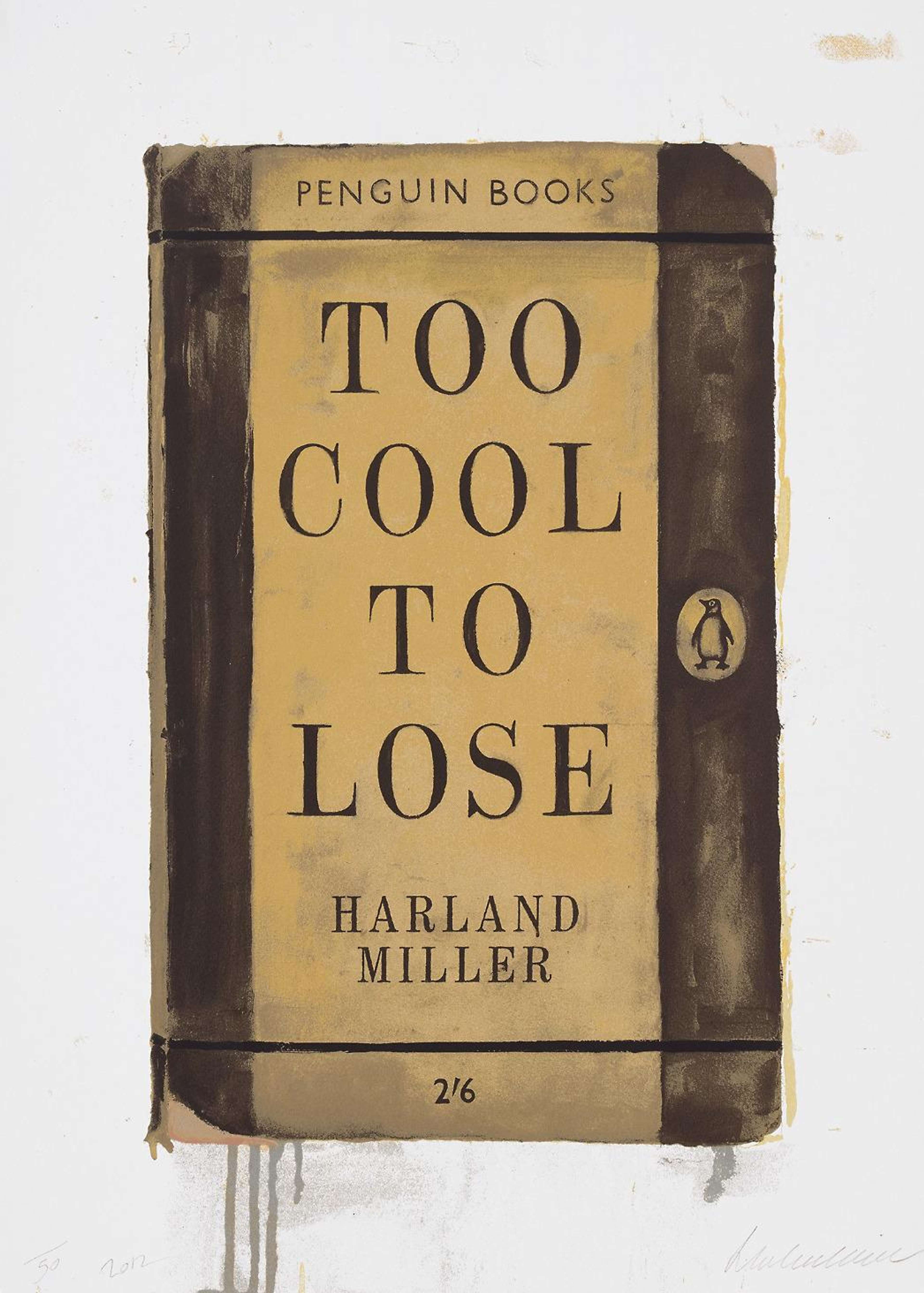
Too Cool To Lose
Signed Print
Harland Miller
£6,500-£10,000Value Indicator
$13,500-$21,000 Value Indicator
$12,000-$19,000 Value Indicator
¥60,000-¥90,000 Value Indicator
€7,500-€12,000 Value Indicator
$70,000-$100,000 Value Indicator
¥1,240,000-¥1,910,000 Value Indicator
$8,500-$13,000 Value Indicator
AAGR (5 years) This estimate blends recent public auction records with our own private sale data and network demand.
There aren't enough data points on this work for a comprehensive result. Please speak to a specialist by making an enquiry.
Medium: Screenprint
Edition size: 50
Year: 2012
Size: H 64cm x W 46cm
Signed: Yes
Format: Signed Print
TradingFloor
Track this artwork in realtime
Watch artwork, manage valuations, track your portfolio and return against your collection
Track auction value trend
Auction Results
| Auction Date | Auction House | Location | Hammer Price | Return to Seller | Buyer Paid |
|---|---|---|---|---|---|
| March 2024 | Christie's London | United Kingdom | |||
| June 2021 | Phillips London | United Kingdom |
Meaning & Analysis
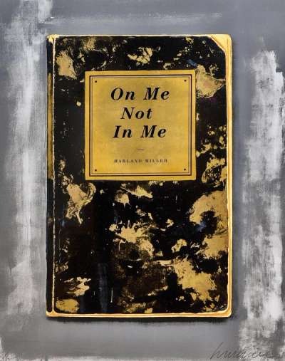
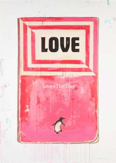
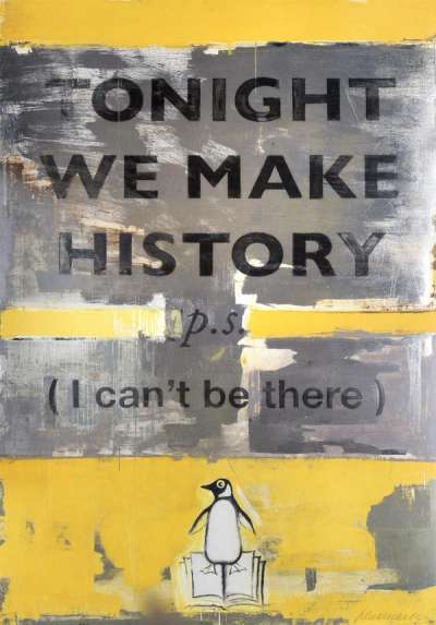
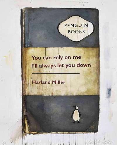
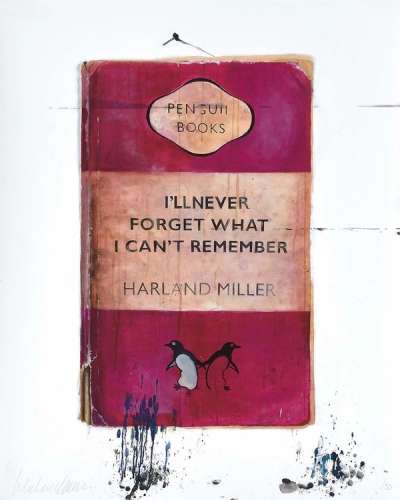
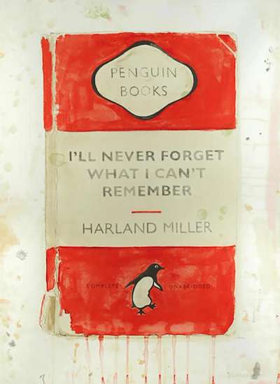
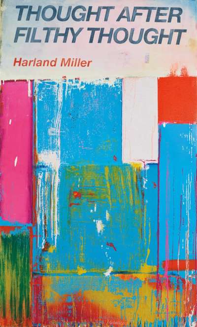
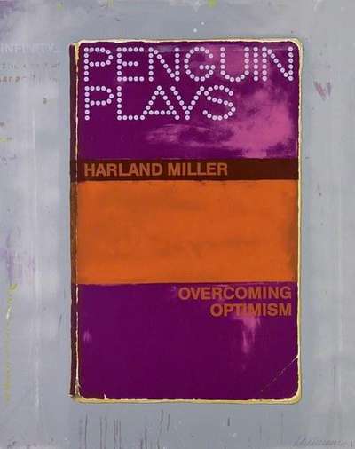
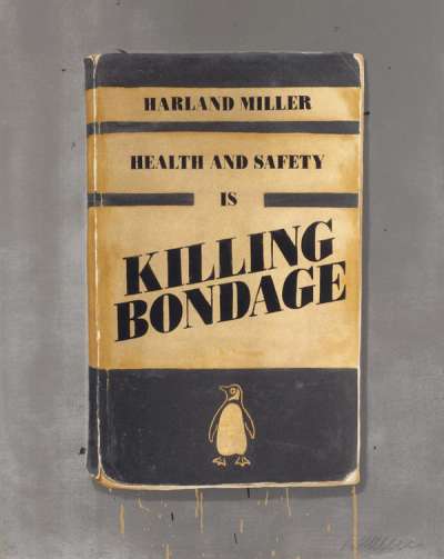
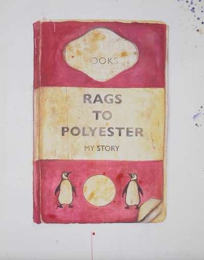
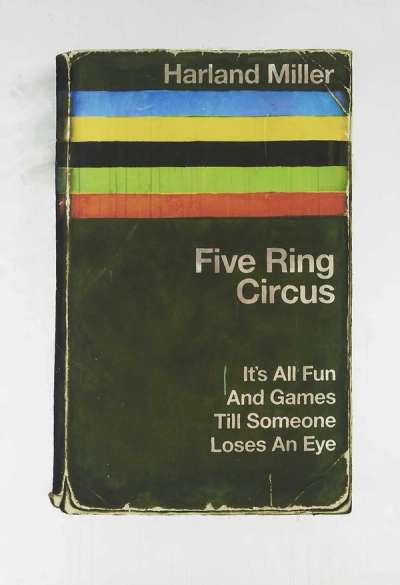
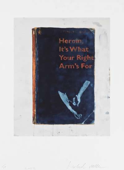
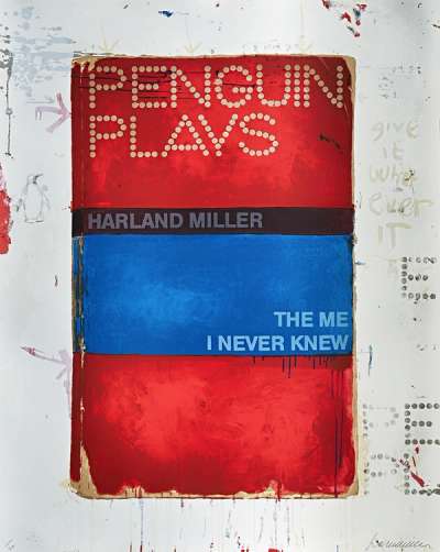
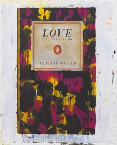
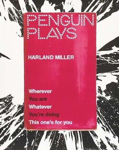
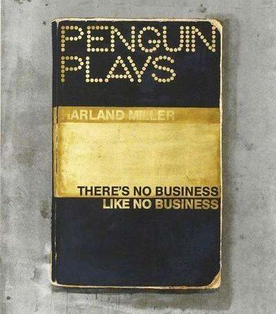
Too Cool To Lose by Harland Miller is a signed screen print which was released in an edition of 50 in 2012. This print from his Penguin series is a great example of the artist’s mastery of colour-coding his invented Penguin titles and coming up with short, punchy yet rich concepts for his texts.
This series of works are based on the dust jackets of Penguin books, their authentic, rugged second-hand look realistically recreated by the artist through a method of layering paint over an original high-resolution digital photograph. The photorealistic rendering is significant in terms of the concept behind the series, such as in the case of this print where the yellow and black have an apparently worn aesthetic and even the dog-eared spine of the book is included. Miller is interested in subverting the familiarity and nostalgia evoked by the well-known Penguin book design, as well as the almost three-dimensional and used representation of the reimagined covers through using them as a context for his satirical, witty and at times controversial statements. Social satire is a core element both to this series and Miller's oeuvre as a whole and experimenting with its representation in various forms that combine text and image. He was drawn to appropriating the Penguin book format because, in his words: “the intention was to bring books to 'the people' - to cheapen the erudite and elitist stuff into looking less intimidating, so pursuits such as bridge could be mastered by anyone. Even if you didn't have a drawing-room, you could still play a mean rubber.”
