Wall
Plates
Patrick Caulfield’s Wall Plates series, produced in 1987, comprises four screenprints depicting plates hung on walls. The series investigates the artistic interplay between everyday objects and their broader symbolic implications. By transforming simple wall plates into subjects of aesthetic and conceptual exploration, Caulfield elevates them beyond their functional roles, using them as vehicles to delve into themes of domesticity, modernity, and isolation.
Patrick Caulfield Wall Plates For sale
Wall Plates Market value
Auction Results
| Artwork | Auction Date | Auction House | Return to Seller | Hammer Price | Buyer Paid |
|---|
Sell Your Art
with Us
with Us
Join Our Network of Collectors. Buy, Sell and Track Demand
Meaning & Analysis
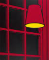
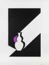
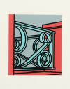
In the Wall Plates series, Patrick Caulfield explores the interplay between light, shadow, and form to create a sense of depth and perspective that belies the simplicity of the subject matter. Each plate is meticulously outlined in black against a dark background, with shadows cast as if illuminated by a sharp light from above, creating a dramatic, almost theatrical presentation. The light not only highlights the circular form of the plates but also casts crescent-shaped shadows that give an illusion of three-dimensionality.
The placement of the plates, slightly off-centre and overlapped by subtle architectural elements, adds a layer of complexity to the compositions. For instance, in Wall Plate: Stones, the plate is intersected by shapes suggesting cobblestones, which disrupt the plate's circularity and introduce an abstract element to the work. This technique reflects Caulfield’s interest in the Cubist movement and its emphasis on the relationship between perception and conception, exploring how still life can serve as a medium for abstract expression.
Caulfield’s use of reduced graphic style pushes the boundaries of how still life can be depicted. This series not only challenges viewers’ perceptions of depth and form but also engages them in a visual dialogue about the nature of art and representation.


