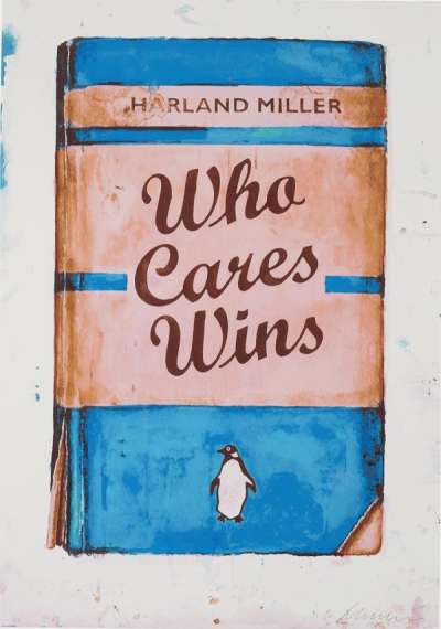
Who Cares Wins (pink)

Who Cares Wins (pink)
Signed Print
Harland Miller
£15,000-£22,000Value Indicator
$30,000-$45,000 Value Indicator
$27,000-$40,000 Value Indicator
¥140,000-¥210,000 Value Indicator
€18,000-€26,000 Value Indicator
$150,000-$220,000 Value Indicator
¥2,810,000-¥4,130,000 Value Indicator
$19,000-$28,000 Value Indicator
AAGR (5 years) This estimate blends recent public auction records with our own private sale data and network demand.
There aren't enough data points on this work for a comprehensive result. Please speak to a specialist by making an enquiry.
Medium: Lithograph
Edition size: 25
Year: 2016
Size: H 58cm x W 43cm
Signed: Yes
Format: Signed Print
TradingFloor
Track this artwork in realtime
Watch artwork, manage valuations, track your portfolio and return against your collection
Track auction value trend
Auction Results
| Auction Date | Auction House | Location | Hammer Price | Return to Seller | Buyer Paid |
|---|---|---|---|---|---|
| January 2018 | Phillips London | United Kingdom | |||
| June 2017 | Phillips London | United Kingdom | |||
| January 2017 | Phillips London | United Kingdom |
Meaning & Analysis
Who Cares Wins (pink) shows Miller’s skill with wordplay and the artist’s more playful side within his Penguin series, based on the colourful dust jackets of popular Penguin Series and his titles characterized as “wittily deadpan, punkish and aphoristic” by novelist Michael Bracewell. The series marries Miller’s love for the written word and his artistic influences of Pop Art, Abstract Expressionism and Mark Rothko’s Colour Field paintings, resulting in a clever exploration of the relationship between text and image through subverting the familiar format of the books and inserting his own writing.
Miller was originally inspired by how the Penguin Classics were colour-coded based on genre and how that affected the perceptions of their titles, as well as using the nostalgia and anti-elitist universality associated with Penguin books to formulate clever statements of social critique. This effect is enhanced by the photorealistic rendering of the rugged original covers, serving as authentic “packaging” for the artist’s message. Who Cares Wins is one of the more positive, hopeful examples of the series, while still being slightly ironic. Miller’s choice of vibrant colours such as red and white for the background signals a more upbeat tone.
British artist, Harland Miller, is renowned for his irreverent reimagining of vintage Penguin book jackets. Playing with nostalgia, cultural, and literary references, the artist combines Pop Art motifs with the brushstrokes of Abstract Expressionism. Miller's paintings and prints are often imbued with dark humour, with works such as You Can Rely On Me I'll Always Let You Down being characterised by an undercurrent of satire and self-depreciation. Exploring the relationship between word and image has undoubtedly allowed Miller's art to comment on the frequent disconnect between representation and reality, and influence artists such as The Connor Brothers in their practice.

