The Literary Canvas: Exploring the Unique Blend of Art and Literature in Harland Miller’s Works

 Gateshead Revisited © Harland Miller 2009
Harland Miller
61 works
Key Takeaways
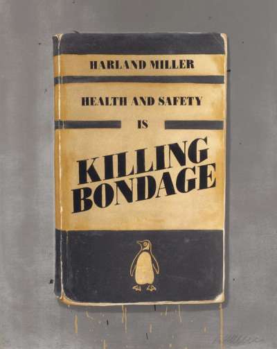
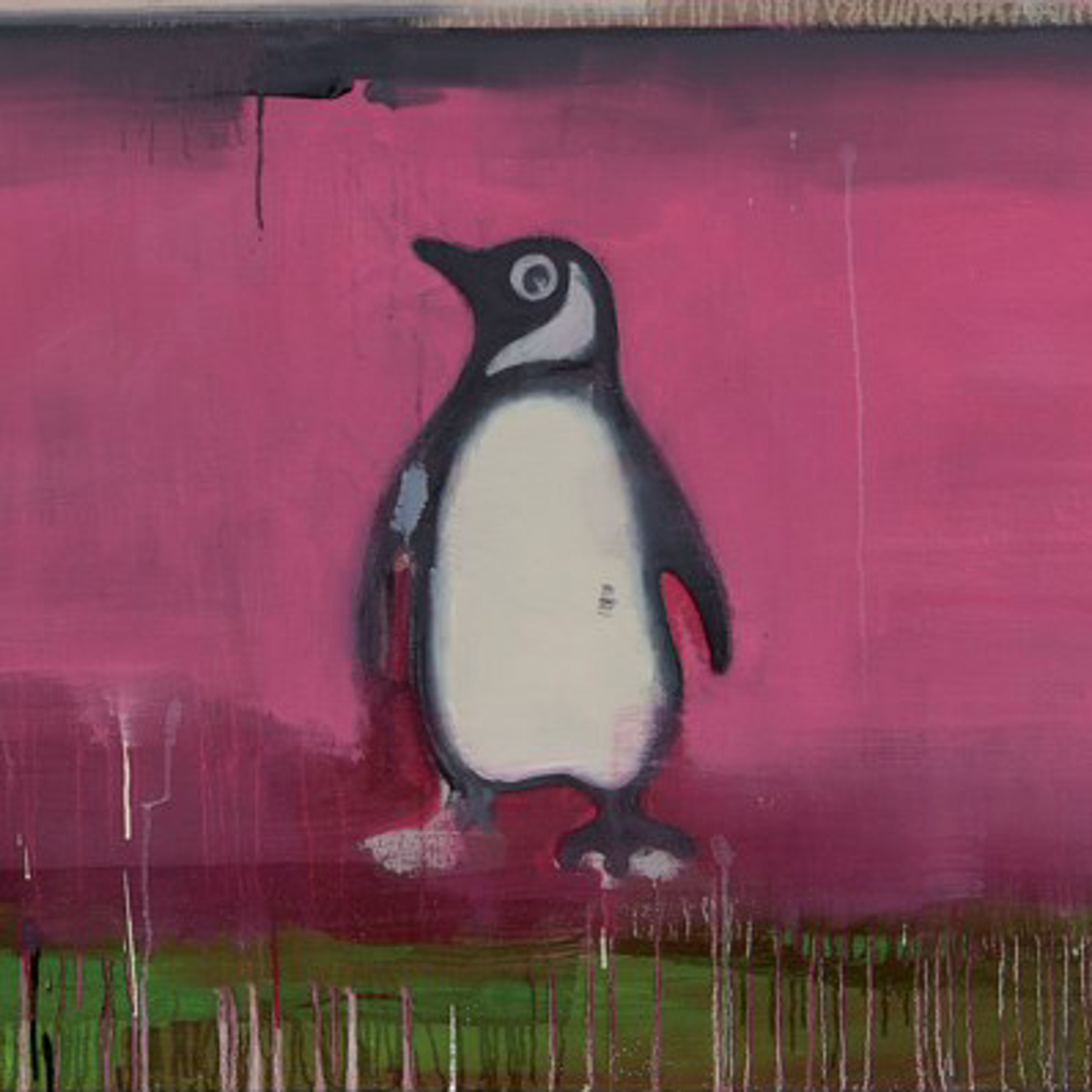
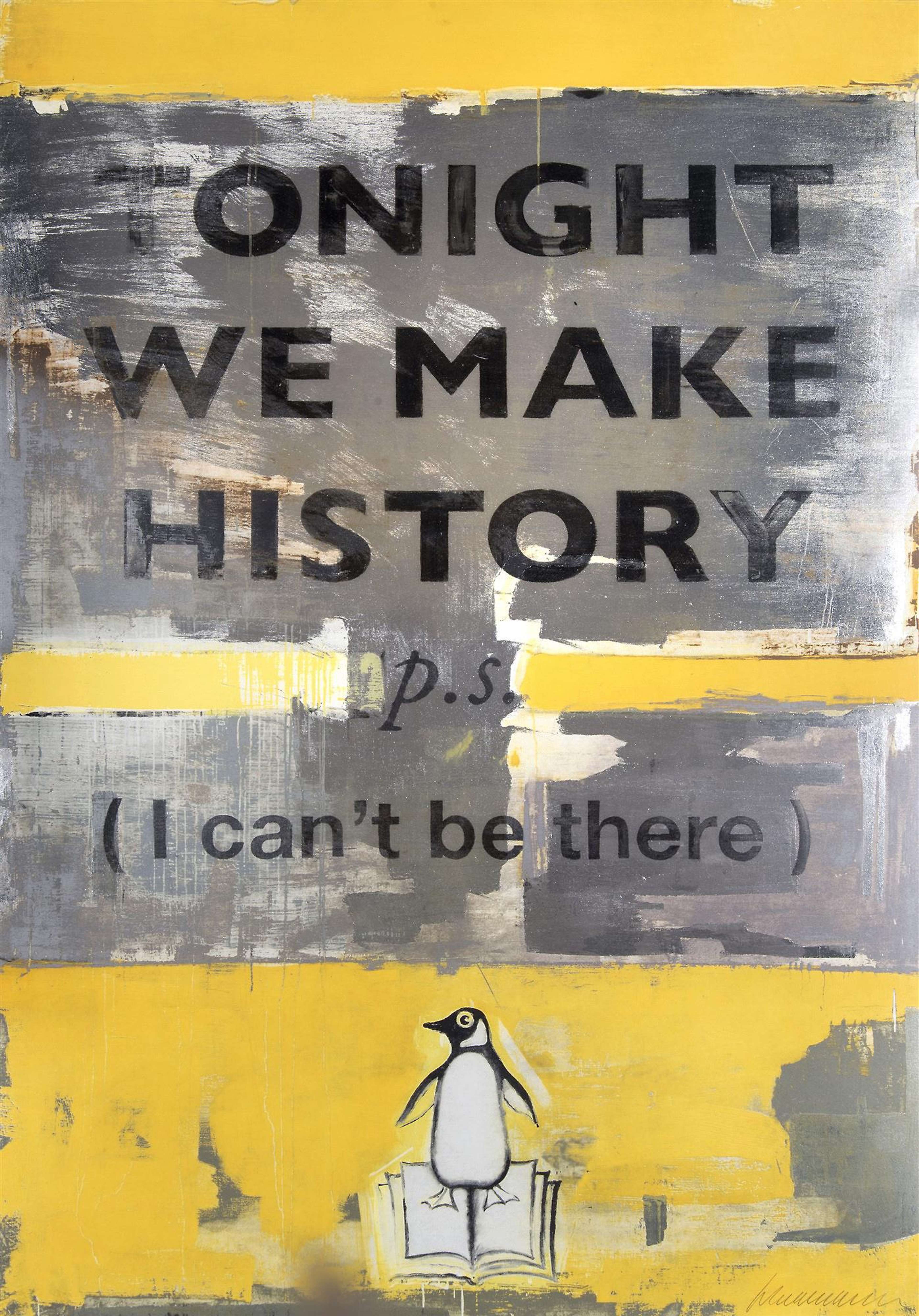
Harland Miller's reimagined Penguin book covers showcase his ability to merge visual art with literary depth, transforming familiar designs into striking commentaries infused with humour, irony, and social critique. Drawing on his background as a writer, Miller's art is steeped in narrative, with his iconic series delving into complex themes of alienation, consumerism, and identity.
Harland Miller has carved a niche in contemporary art as an artist whose work seamlessly blends literature and visual art. His ability to intertwine narrative and imagery has redefined the boundaries of typography and art, creating a literary-inspired approach that adds depth and meaning to his work.
Harland Miller: The Writer Before the Artist
Early Life and Literary Influences
Miller’s journey into the world of art began with a deep engagement in literature during his formative years. Growing up in Yorkshire, England, his early life was marked by an intense curiosity and love for storytelling, which was nurtured by key literary influences, including the works of Ernest Hemingway, F. Scott Fitzgerald, and the Brontë sisters. These authors shaped his worldview, imbuing him with a sense of narrative that would later become integral to his artistic expression.
Career as a Writer
Before becoming known as an artist, Miller pursued a career as a writer, penning novels including his debut novel Slow Down Arthur, Stick To Thirty (2000) and First I Was Afraid, I Was Petrified (2000), his writing characterised by a distinctive blend of humour, irony, and introspection. Slow Down Arthur follows the character Kid Glover as he navigates 1980s Yorkshire with Ziggy Hero, a David Bowie impersonator, whilst First I Was Afraid consists of a large collection of polaroids taken by a relative of Miller, all of a gas cooker turned to off, documenting the habits of someone with Obsessive Compulsive Disorder.
Miller’s transition from writing to visual art marked a significant turning point in his career. The shift allowed him to incorporate text into his visual work, merging his two passions and giving him the “pleasure to imagine a book I had already written and then painting it”.
The Intersection of Writing and Visual Art
Literary Roots in Visual Art
Miller’s background as a writer plays a crucial role in the conceptual and thematic elements of his visual artworks. His experience with storytelling permeates his pieces, often making them feel like visual stories in their own right. Miller’s art is layers of meaning, each work inviting viewers to delve into the narrative threads that underpin the imagery. This intersection of writing and visual art sets Miller apart, making his work not just visually appealing, but also providing an introspective commentary on wider themes.
Reimagining the Penguin Book Covers
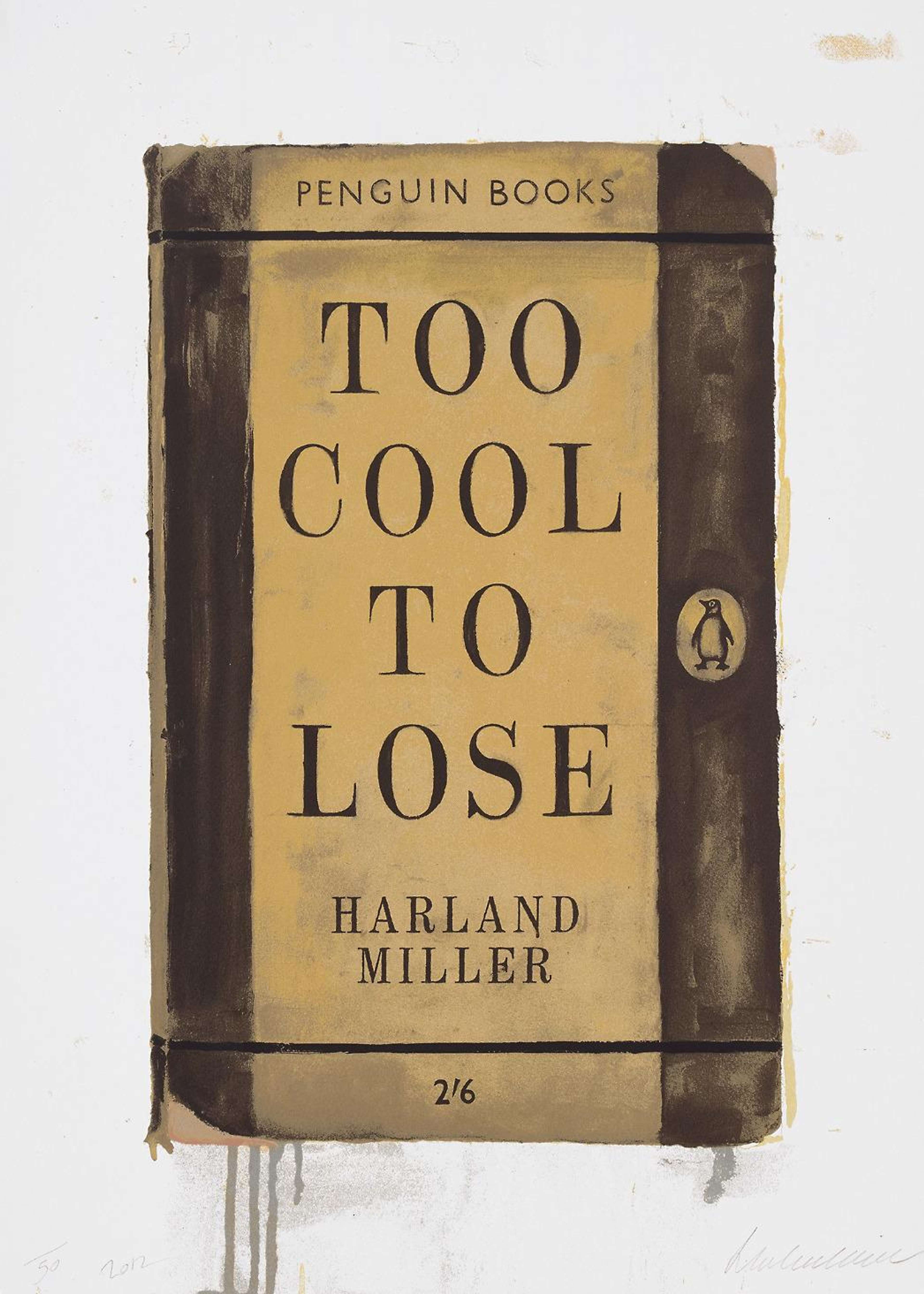
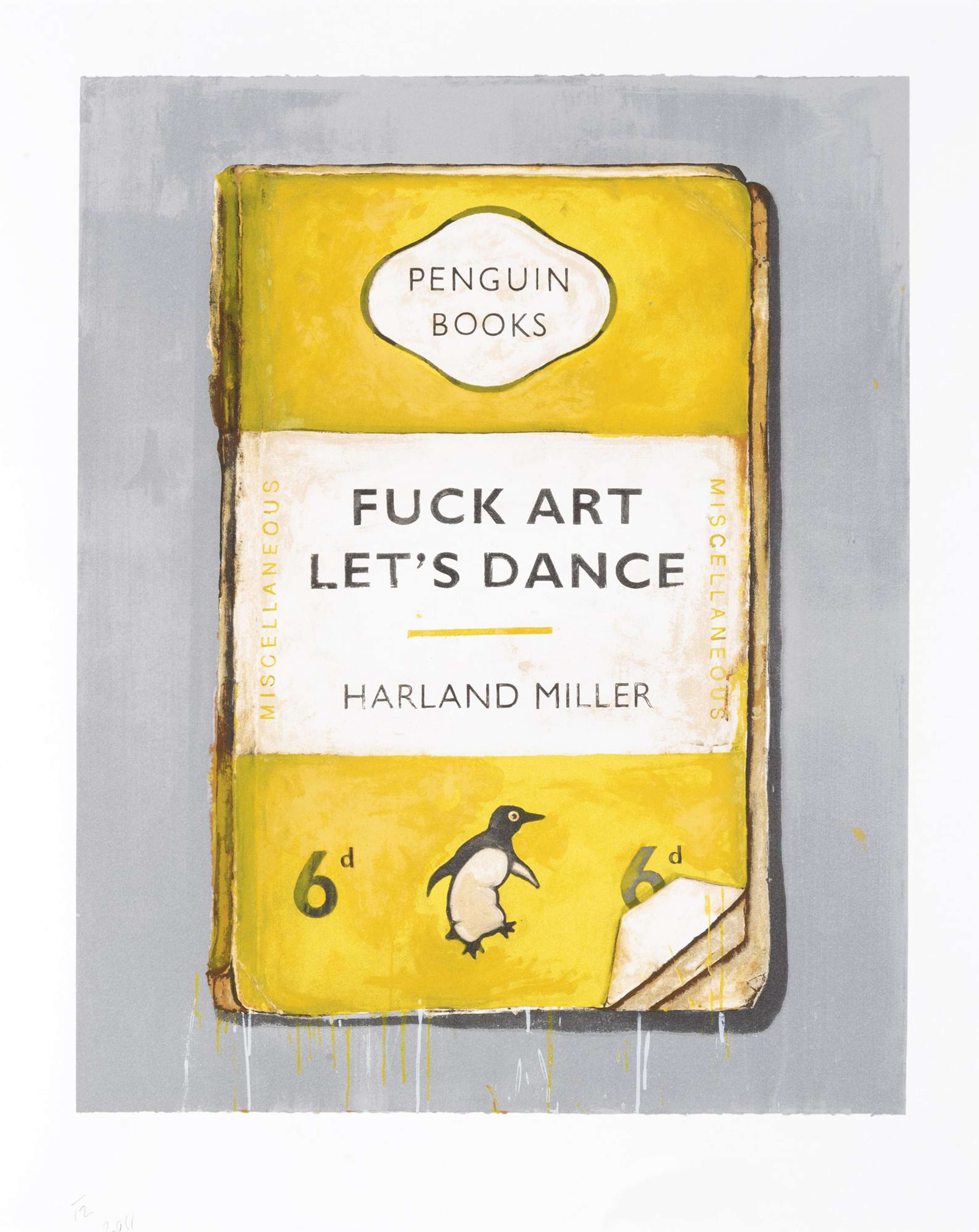
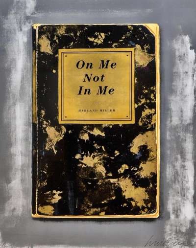
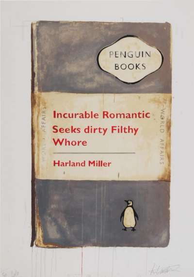
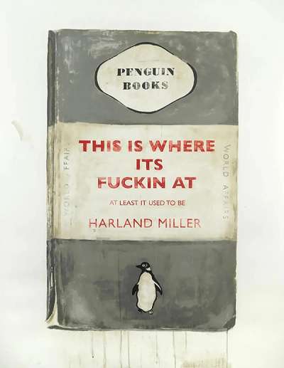
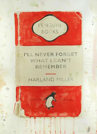
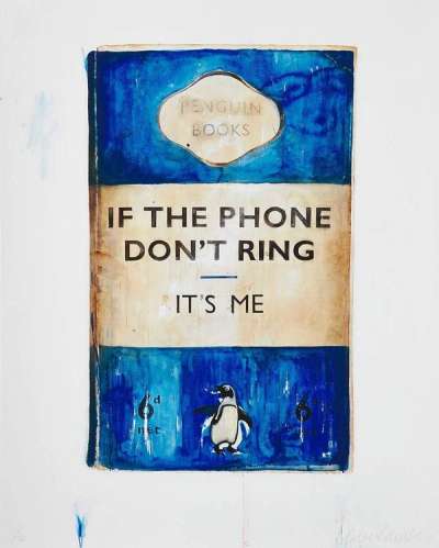
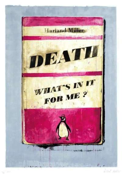
One of Miller’s most iconic contributions to contemporary art is his reimagining of the classic Penguin book covers. These works are a brilliant marriage of literature and visual art, where Miller uses the familiar design of Penguin paperbacks as a canvas for witty, reconstructed epigrams. The nostalgic significance of these covers, combined with Miller’s dark humour and social commentary, creates a powerful impact, demonstrated by pieces such as I Am The One I’ve Been Waiting For (2012) and You Can Rely On Me, I’ll Always Let You Down (2011). These pieces utilise symbols of ‘high-class’ literature, combined with tongue-in-cheeky witticisms, making them both timeless and timely.
Text as a Central Element in Miller’s Art
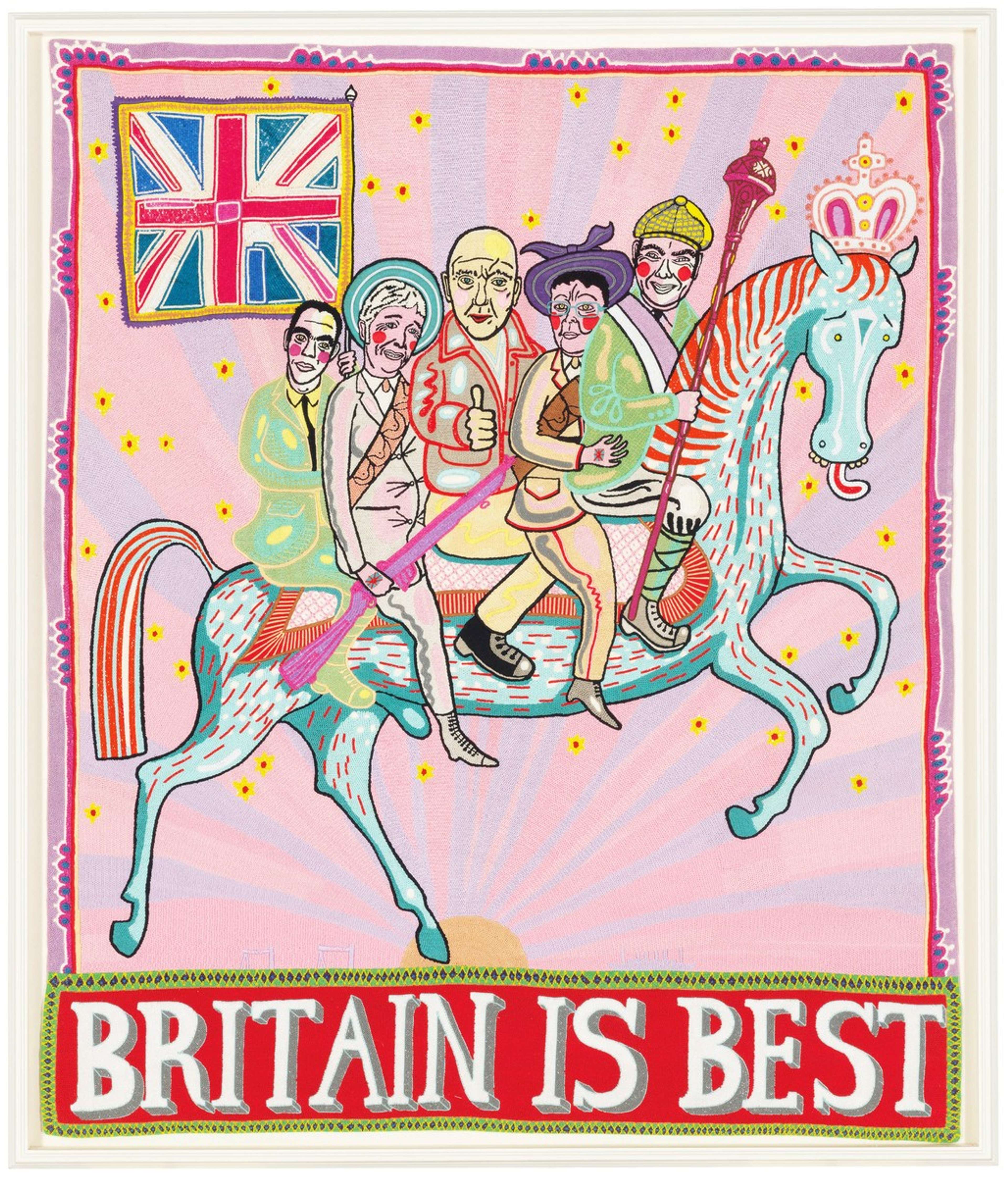
Artists don’t just use letters and words in their art for visual qualities such as shape and texture, they also use them to construct a narrative. In the work of David Hockney, Grayson Perry, and Tracey Emin, words are juxtaposed with images in a raw, expressive way to reveal personal thoughts and feelings. Conceptual artists often prioritise the ideas behind their work over the visual form, using text as a key element to express these ideas.
Ed Ruscha often pairs familiar phrases with unrelated images, prompting viewers to question the connection between what they see and read. His work Pay Nothing Until April (2003) juxtaposes a mountain landscape with an advertising slogan, reflecting the contrast between the natural and the commercial, and capturing the essence of Los Angeles, a city he describes as "the ultimate cardboard cut-out town."
In Miller’s artworks, text is not just an element but often the centrepiece. The balance between visual aesthetics and literary content is a hallmark of his work, where each piece is as much about the message conveyed by the text as it is about the imagery. This use of text adds a layer of depth, encouraging viewers to engage with the work on multiple levels.
Humour, Irony, and Social Commentary
Miller’s literary background is also evident in the humour, irony, and social commentary that permeates his work. His art, characterised by a playful yet barbed style, uses irony and satire to explore the contradictions of modern society, often challenging viewers to look beyond surface humour to engage with deeper societal issues. By juxtaposing nostalgic imagery with provocative text, Miller highlights themes of alienation, consumerism, and the complexities of human emotions, seen in pieces such as Rags To Polyester (2014) and International Lonely Guy (2008). Through this eye-catching technique, Miller solidifies his place as a distinctive voice in contemporary art that simultaneously entertains and critiques.
 Image © Christie’s / I’m So Fucking © Hard Harland Miller 2009
Key Artworks Showcasing Miller’s Writer-Artist Identity
I’m So Fucking Hard Ernest Hemingway
Miller’s early Penguin art, Im So Fucking Hard Ernest Hemingway (2002), demonstrates the artist’s affinity for fusing his love of words with the visual language of book covers. Miller’s provocative choice of words is not only used as a reference to one of his great inspirations, but the piece’s bold and irreverent language is also used to play on the hyper-masculine image often associated with the literary giant Hemingway.
The title itself is a provocative twist, blending Miller’s trademark humour, emotion and literary interest, with a critique of the toughness and bravado that Hemingway is famous for. By placing this statement on a large scale, vintage-style book cover, Miller not only references Hemingway’s rugged persona, but also questions the glorification of such an identity in literature and culture. The artwork reflects Miller’s skill in merging literary homage with satirical commentary, creating a piece that is as thought-provoking as it is visually striking.
Gateshead Revisited
Another piece that showcases Miller’s love of literature is Gateshead Revisited (2009). This adaptation of Evelyn Waugh’s 1945 novel's title, Brideshead Revisited, draws upon Miller’s Northern roots, the re-working of a book title specific to the North-East of England both celebrating his national identity, whilst injecting a fresh interpretation of the traditional paperback aesthetic into contemporary culture. Within this piece, Miller uses his trademark play on words and distinctive visual language to not only demonstrate a sophisticated cultural and literary knowledge, but also to subvert Southern-centric assumptions surrounding class and education.
Mastering the Art of Words and Imagery in a Literary-Visual Dialogue
Miller's work stands as a testament to the powerful synergy between literature and visual art. Through his reimagined book covers and text-based pieces, Miller blurs the boundaries between these two forms of expression, creating art that is intellectually engaging and visually captivating. His ability to infuse humour, irony, and cultural commentary into his work not only highlights his literary roots, but also cements his unique position in contemporary art. Miller’s artworks are more than just paintings; they are narratives that invite viewers to explore deeper meanings, reflecting the complexities of modern life through a literary lens.


