Ed Ruscha’s Play with Typography: Transforming Words into Art

 Image © Tate / Honk © Ed Ruscha 1962

Ed Ruscha
239 works
Key Takeaways
Ed Ruscha's transformative use of typography has made him a pivotal figure in contemporary art, turning ordinary words into powerful visual statements. His work, influenced by pop culture, advertising and literature, redefines the relationship between language and visual art. By incorporating diverse techniques and innovative materials, Ruscha challenges viewers to reconsider the aesthetic and conceptual power of text.
Typography is at the centre of Ed Ruscha’s art, his unique ability to transform seemingly mundane words and text into the extraordinary have made him a pivotal figure in contemporary art. As early as 1959, his works have engaged with the interplay of words and images, redefining how we perceive both language and visual art. Through his innovative use of typography, Ruscha explores language through devices such as onomatopoeias, alliteration and humorous juxtaposition. This wordplay articulates Ruscha’s cultural commentary on his surroundings, particularly Los Angeles, and compels his viewers to consider the aesthetic and conceptual power of text.
Early Influences and Beginnings
Background and Artistic Development
Born in 1937 and raised in Oklahoma City, Ruscha’s early life was marked by a fascination with the visual world, his mother encouraging his creative interests in cartooning. His move to Los Angeles in the 1950s to study at the Chouinard Art Institute, Los Angeles, would have a significant influence on his work. The city’s burgeoning pop culture and accelerated culture provided a rich visual landscape for Ruscha to comment on, LA’s iconic billboards, distinctive geometric architecture and ‘all-American’ lifestyle featuring prominently throughout his oeuvre.
Transition to Text-Based Art
Ruscha's shift towards incorporating text into his art was gradual but deliberate. The humorous incorporation of language by Dadaists was an early influence on Ruscha, and his background as a layout artist for an advertising agency, combined with the increasingly popular clean lines and bold graphics of commercial art, led to him experimenting with words as primary visual elements. His work Large Trademark with Eight Spotlights (1962) marked a significant departure from traditional painting, where the emphasised text ‘20th Century Fox’ became as important as the image itself. Ruscha’s early works were very well received, and in 1962 a number of Ruscha’s text-based works were chosen by a collector for the New Painting Of Common Objects exhibition at California’s Pasadena Art Museum. The exhibition features works such as Ruscha’s OOF (1962) alongside those of Roy Lichtenstein and Andy Warhol and became the youngest artist to be associated with the nascent Pop Art scene, allowing Ruscha’s career to take off rapidly.
Typography as Visual Language
The Aesthetic Appeal of Words
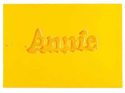
For Ruscha, typography is more than just a vehicle for conveying information, it is a visual language in its own right. His meticulous selection of fonts, sizes, and arrangements reflects a deep understanding of how text can function as a purely visual element. Whether it's Ruscha’s self-designed font ‘Boy Scout Utility Modern’ dominating the piece, or his experimental ‘liquid words’ spilling off the canvas, each typographic choice contributes to the overall aesthetic impact of the work. Ruscha often plays with scale, making words loom large or shrink to insignificance, thereby altering their visual and emotional weight.
Creating Mood and Meaning
The way Ruscha presents words on the canvas significantly affects their interpretation. A single word painted in vibrant colours can evoke a sense of urgency or excitement, while the same word rendered in muted tones might suggest introspection or melancholy. In works like OOF (1962), the stark simplicity of the text, combined with its bold presentation, creates an immediate, visceral reaction, mimicking the nature of the onomatopoeia.

Innovative Techniques and Styles
Creating Words
Ruscha's approach to painting text is as innovative as it is varied and he often employs unconventional materials and techniques. For example, the late 1960s and 1970s witnessed an experimental period in which Ruscha used gunpowder to produce works such as Juice (1967) and Oxides (1971).
The texture and colour of the text are integral to the work, with the materiality of the words themselves adding layers of meaning. For instance, in his Stains series, Ruscha used organic substances to create letters, leaving a residue that evokes impermanence and decay, contrasting with the permanence usually associated with text. This technique emerged out of Ruscha’s desire to explore outside of paint, the artist utilising a variety of materials, including wine, beer, LA tap water and sulphuric acid, to pursue his artistic vision.
Use of Commercial Signage and Advertising
Commercial signage and advertising have heavily influenced Ruscha’s typographic style. The bold, direct language of advertising is often mirrored in his works, where everyday phrases and brand names are stripped of their commercial context and repurposed as art. His works, such as Standard Station (1966), Public Market (2006) and Gas (1962), transform the banal into the profound, and by isolating and elevating the language of consumer culture, he invites viewers to reconsider the words that permeate their daily lives, revealing the latent meanings and cultural significance embedded within them.


Notable Works and Their Typographic Elements
Standard Station Series
The Standard Station series is among Ruscha’s most iconic works, where typography plays a crucial role in enhancing both the visual and thematic elements. The word ‘Standard’, emphasised across the front of the gas station, is not just a brand name but a commentary on the uniformity and predictability of American life in the mid-20th century. The typography in this series is clean and industrial, reflecting the functional design of commercial signage while also serving as a metaphor for the standardisation of culture.
Hollywood Series
In Ruscha’s Hollywood series, the artist capitalises on the iconic status of the Hollywood sign, using its typography to explore themes of fame, illusion, and decay. The stylized, block letters of the sign are instantly recognizable, yet in Ruscha’s hands, they become a symbol of the transient nature of success and the artificiality of the entertainment industry. The typography here is not just a visual element but a cultural icon in itself, loaded with connotations and history.
OOF and Other Text Paintings
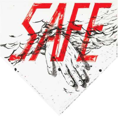
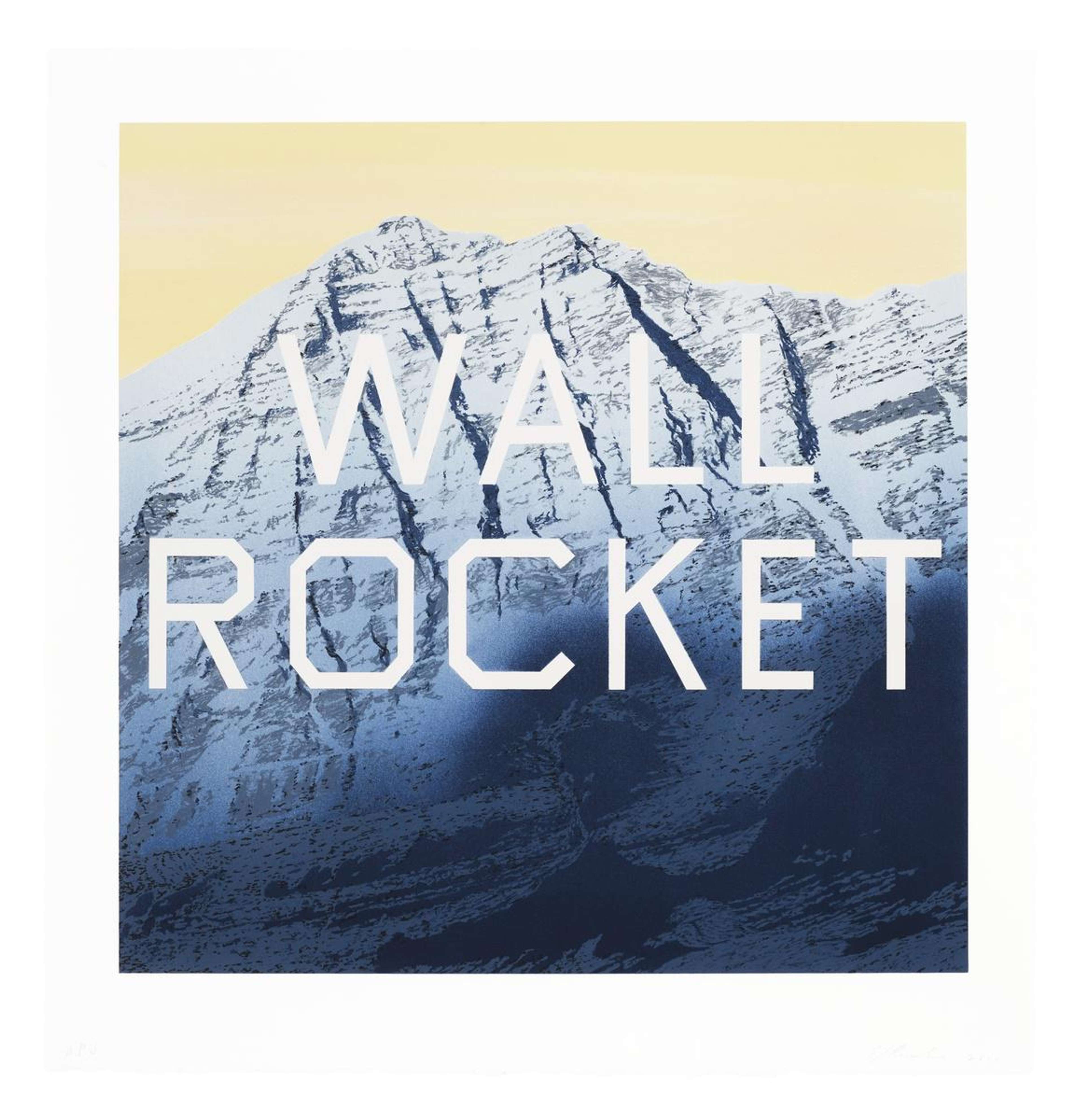
Ruscha’s OOF (1962), and similar text paintings such as Honk (1962) and Adios (1969), distil language to its most basic elements, using single words to evoke complex emotional responses. OOF, painted in bold yellow letters against a blue background, captures a moment of impact or realisation, a verbal punch. The simplicity of these works belies their depth, as the choice of word, colour, and scale creates a powerful emotional and visual impact. Ruscha’s text paintings demonstrate how even the most minimal use of language can resonate profoundly with viewers.

Themes and Symbolism in Typographic Art
Pop Culture and Consumerism
Ruscha’s use of text often reflects his commentary on pop culture and consumerism. By appropriating the language of advertising and branding, he critiques the pervasive influence of consumer culture on our lives. Works like Large Trademark with Eight Spotlights (1962) and Hollywood (1968) showcase how Ruscha uses recognisable corporate logos and phrases to both celebrate and critique the commodification of culture. His typographic art often blurs the line between celebration and satire, leaving viewers to draw their own conclusions about the impact of consumerism on society.
Language and Communication
Beyond pop culture, Ruscha’s work delves into the nature of language and communication itself. His typographic art often plays with the meaning and interpretation of words, challenging viewers to reconsider their assumptions about language. In works such as Noise, Pencil, Broken Pencil, Cheap Western. (1963) and Hurting The Word Radio #2 (1964), where text is deliberately hard to read, damaged, or juxtaposed with incongruous colours, Ruscha explores the limits of communication and the potential for misunderstanding. This exploration of language is central to his practice, as he uses typography not just to convey messages but to question the very nature of meaning.
Ruscha’s preoccupation with language is often inspired by his love of literature, the artist infusing and taking inspiration from different textual sources. An admirer of British writer J.G. Ballard, Ruscha’s The Music from the Balconies (1984) uses text from the author’s novel High Rise 1975. Ballard’s fiction, associated with bleak dystopian modernity, provides a pertinent lexical inventory for Ruscha’s own social commentary.
Impact on Contemporary Art and Typography
Influence and Legacy
Ruscha’s innovative use of typography has had a profound influence on subsequent generations of artists. His ability to transform words into visual art has inspired countless others to explore the possibilities of text in their own work. Artists like Barbara Kruger and Jenny Holzer, who also use text as a central element in their art, are evidence of Ruscha’s creative impact. His influence extends beyond the art world, impacting graphic design, advertising, and even literature, where his blending of text and image has opened new avenues for creative expression.
Enduring Legacy in the Intersection of Art and Typography
Ruscha's exploration of typography has indelibly shaped the landscape of contemporary art, establishing him as a vital figure in the intersection of language and visual culture. By transforming everyday words into powerful visual statements, Ruscha challenges viewers to rethink the role of text in art, and how language can convey meaning beyond its literal interpretation. Through his innovative approach, Ruscha continues to inspire and provoke, ensuring that his influence on the world of art and design will endure for generations to come.