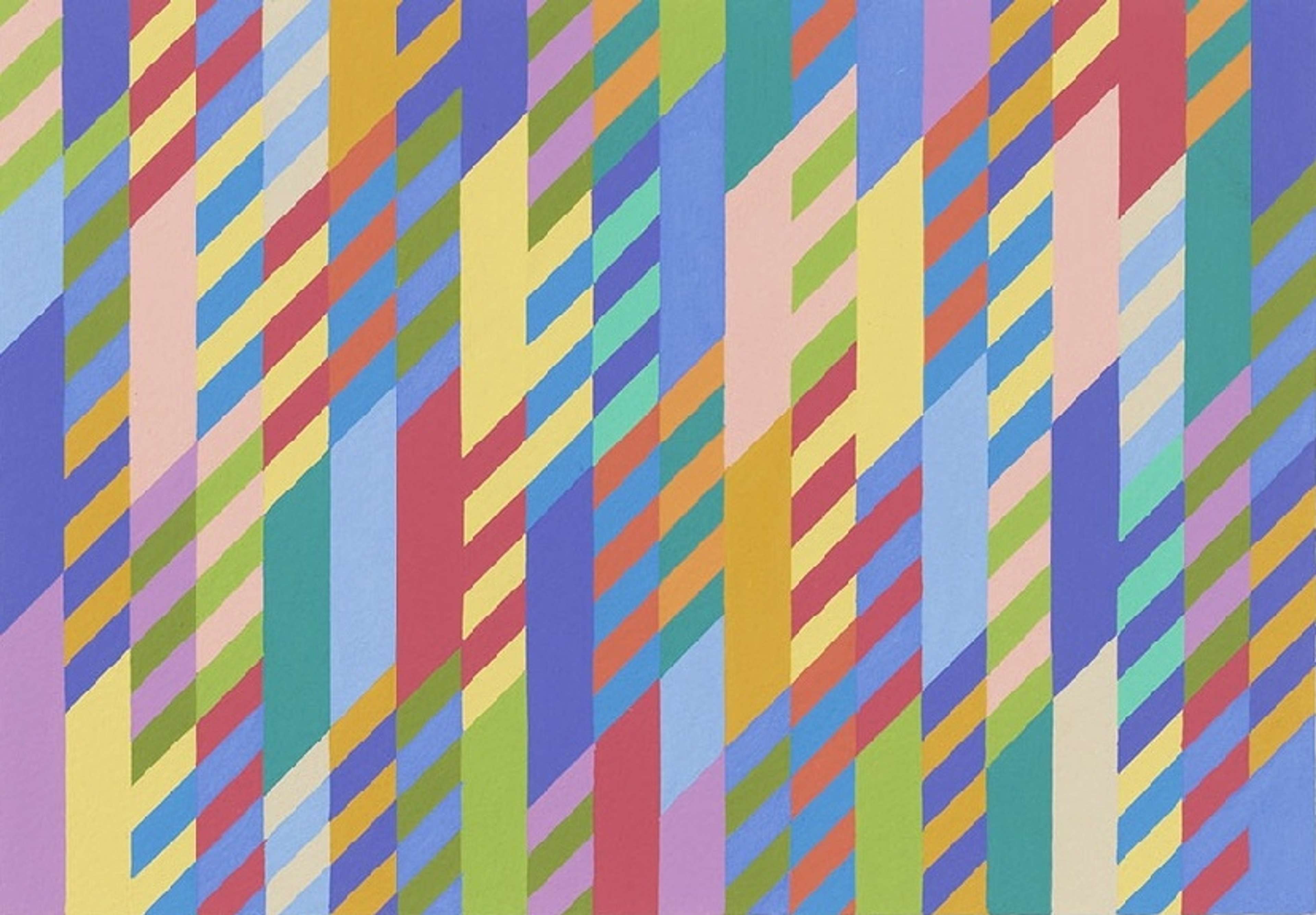
 June © Bridget Riley 1992
Bridget Riley
111 works
The Zig/Rhomboid print series was created by Bridget Riley in 1989. It is an example of her exploration of colour and form and represents her Op Art style.
This series is reminiscent of an earlier one
 Fête by Bridget Riley, 1989
In the Zig / Rhomboid collection, Riley has begun to cross her iconic horizontal stripes of her earlier Stripes works with short diagonal elements.
The series adds an element of complexity to previous Stripes iterations
 To Midsummer by Bridget Riley, 1989
Executed in the 1980s and 1990s, these works evolved from the previously harmonious order of stripes as Riley sought to find new ways to generate interactions between colours.
These works navigate two-dimensionality and three-dimensionality
 New Day by Bridget Riley, 1989
Even more dynamic and complex, these shapes straddle two-dimensionality and three-dimensionality, creating a sensation of motion that the static, horizontal-line works lacked.
Riley moved into using colour in 1967
 Early Light by Bridget Riley, 1989
A seismic shift occurred in Riley’s practice in 1967 as she introduced colour into her works. Now, her focus was on the effect of varying colour combinations and the potential for narrative and emotion that this brings, concerned less with constructing optical illusions.
This series emphasises a lack of distinction made between shape and colour
 June by Bridget Riley, 1989
Moving away from the lines and geometric shapes that defined her earlier works, in the Zig/ Rhomboid works, distinctions between colour and shape fall away, each leaning on the other for definition within the same plane.
Riley was innovative with the rhomboid shape
 Shade by Bridget Riley, 1989
By fashioning this innovative rhomboid form Riley claims a “whole new field of relationships opened up”.
This series is about colour and space
 Going Across by Bridget Riley, 2001
When enlarged, such as in Shade (1992), these forms become coloured planes that can take up different positions in space. Ultimately, these shapes serve several functions: “they can change scale, harmonise or contrast with one another, repeat, echo, ’create places’, etc.”
Juxtaposition is also important in this series
 Rose Rose by Bridget Riley, 2011
Across her oeuvre, Riley teases out the different energies inherent in varying tonalities, delighting in the push-and-pull created through the juxtaposition of competing colours.
Riley's work changed throughout her career
 Two Blues by Bridget Riley, 2003
From 1961 to 1964, Riley worked exclusively in black and white, introducing tonal greys in the late 1960s, and expanding this to a full spectrum of colour in 1967. Starting exclusively with lines in 1967, Riley then adapted these into the diagonal shapes we see in this collection.
Riley was inspired by Georges Seurat
 About Lilac by Bridget Riley, 2007
When first exhibited, many interpreted Riley’s diagonal rhomboid forms as painterly strokes, enlarged and formalised, deriving once more from Georges Seurat.
